Introduction
You can run the best ad in the world, but if your landing page isn’t effective, all your paid traffic goes to waste. A landing page is where your ad turns into a conversion — or not. In this article, you’ll learn how to build high-converting landing pages that work seamlessly with your paid ads and help you lower costs while increasing ROI.
1. What Makes a Landing Page “High-Converting”?
A high-converting landing page is focused, clear, and built to guide the user toward a single action. That action might be:
- Submitting a lead form
- Making a purchase
- Downloading a free resource
- Registering for a webinar
The goal is to eliminate distractions and friction, making it easy for the visitor to say “yes.”
2. Match Ad and Page Messaging
The first key to conversion is message match — making sure your landing page headline and content align with your ad.
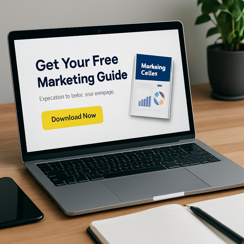
If your ad says “Download our free marketing checklist,” the landing page should:
- Repeat that promise in the headline
- Show the checklist visually
- Provide a fast, easy way to get it
Inconsistent messaging leads to confusion and drop-off.
3. Use a Clear and Compelling Headline
Your headline is the first thing visitors will read — and it should grab their attention while reinforcing your value proposition.
Tips:
- Make it benefit-driven
- Keep it under 12 words
- Address a problem or desired outcome
Example:
“Double Your Email List in 7 Days — Free Guide Inside”
4. Remove All Distractions
Unlike your homepage, a landing page should have:
- No menu or external links
- No sidebars or multiple CTAs
- One goal, one CTA
The more options you give users, the less likely they are to convert.
5. Write Strong, Benefit-Driven Copy
Use short paragraphs, bullet points, and bold headlines to highlight:
- What the offer is
- Why it’s valuable
- What happens next
Talk about benefits, not just features. For example:
❌ “Includes 10 PDF pages”
✅ “Get step-by-step instructions to grow your audience”
6. Use Social Proof and Trust Elements
People are more likely to convert if they trust you. Add:
- Testimonials from past users
- Trust badges (SSL, secure checkout, verified reviews)
- Logos of companies you’ve worked with
- Real photos of customers or users
This builds authority and credibility fast.
7. Include a Clear, Action-Oriented CTA
Your call to action should be:
- Visually distinct (use color contrast)
- Action-oriented (e.g., “Get Instant Access,” “Start Free Trial”)
- Positioned above the fold and repeated throughout the page
Use only one CTA per page to avoid confusion.
8. Optimize for Speed and Mobile
Over 60% of paid traffic comes from mobile devices. If your page loads slowly or doesn’t work on phones, users will bounce.
Checklist:
- Loads in under 3 seconds
- Mobile-responsive design
- CTA buttons large enough for fingers
- Fonts easy to read on small screens
Use tools like Google PageSpeed Insights to check performance.
9. Use Visuals That Support the Message
Add:
- Product screenshots
- Explainer videos
- Illustrations of your offer
- Icons to highlight key points
Visuals help users understand your offer faster and improve engagement.
10. A/B Test Key Page Elements
Just like with your ads, you should A/B test elements of your landing pages:
- Headlines
- Button colors and copy
- Layouts
- Testimonials placement
- Number of form fields
Test one variable at a time and optimize based on results.
11. Keep Forms Short and Simple
Forms should only ask for the information you truly need.
Examples:
- Lead magnet opt-in: Name + email only
- Consultation request: Name, email, phone, short message
- Checkout: Essential billing/shipping info only
Shorter forms = higher completion rate.
12. Create Urgency and Scarcity
Encourage immediate action with:
- Countdown timers
- “Only 5 spots left” notices
- “Today only” offers
Just make sure your urgency is real — fake scarcity can hurt your brand.
13. Say “Thank You” with a Next Step
After someone converts, don’t leave them hanging. Redirect to a thank you page that:
- Confirms their action
- Delivers the promised item
- Offers the next step (e.g., follow on social, book a call)
This keeps the momentum going.
Conclusion: Landing Pages Are Where the Magic Happens
Great ads get attention, but great landing pages close the deal. By focusing on clarity, alignment, speed, and user experience, you’ll turn more of your paid traffic into real results — whether that’s leads, sales, or sign-ups.
Test consistently. Refine based on data. And never stop improving your landing page game.


